 By: Tucker Schreiber
Your storefront looks great. You’ve spent a lot of time tweaking it and making sure everything flows properly.
But why aren’t any visitors adding products to their cart? You’ve taken time to advertise your store and it’s getting traffic, but it isn’t converting.
Perhaps your visitors are having a hard time navigating your store because there isn’t a clear call to action. They simply don’t know where to click.
In this post, we’ll take a look at some inspirational examples of stores that have fantastic call to actions. You’ll be able to take their techniques and apply them to your own store.
Let’s get started.
What is a Call to Action?
Your call to action is what tells visitors what to do, where they should click, and what to buy. It’s what lights a path to your checkout and turns a visitor into a customer as quickly as possible.
The most obvious example of a call to action is a “Buy Now” button, or a “Shop Now” button on your storefront.
There’s no definitive answer on which button, phrase, styling or size works best, so it’s important to always test and optimize your storefront.
Let’s dig in to what some of the basics are for an effective call to action.
Making an Effective Call to Action: The Basics

While this is something that can be tested, optimized and modified for years depending on your store, it’s good to have a basic understanding of what techniques should be used to make an effective call to action.
Urgency Increases Conversion Rates
When shoppers feel an opportunity is limited, they may be more inclined to purchase.
You see it in retail store displays all the time. Often, you’ll see end of season sales that run for a week. The same can be applied to your ecommerce store.
For instance, if somewhere on your storefront you included a stock level, or something that says “Buy now – only on sale until midnight” then you’re building on the sense of urgency.
A case study by the team at ConversionXL shows that by adding a sense of urgency to their product, they were able to increase their conversion rate by 332%. That’s a huge lift for any business.
Test Different Colors
While there’s no definitive color that converts best, it’s important to ensure that you’re using a color that resonates with your visitors, and your brand.
Here are a few tips to consider when determining which color to use for your CTA.
Use white space around your CTA to make it clear where to click
Make sure it stands out from the background
Don’t make it too crazy with colors and animations
Use Simple Buttons and Copy
While most Shopify themes already include this feature, it’s good to make sure your CTA appears as a button and not just text. Even if its surrounded with a small border, it’s better than having just a text link.
There is a lot of data and studies that show that buttons work well for directing visitors to the checkout process.
Make sure to keep the text within the button short and sweet as well. A simple “buy now”, “add to cart”, “buy” works well.
Tip: You can cater your button copy to the market you’re selling. If you’re selling something like coffee, try changing the copy on your buy button to “Brew it” and see if that helps with conversions!
Hero Images Are Important on Your Storefront
Hero images can be used to highlight a product or collection – in other words, they can be used as a massive call to action.
One study by Notre Dame University shows that the first image out of five images received 84% of all clicks on stores with rotating slideshows.
Be sure to have your hero image link to a product, or collection to get visitors to checkout faster.
Keep it “Above the Fold”
Try to keep everything above the fold if you can. The “fold” of a storefront is the point on any website that comes after scrolling down. Any content above the fold is what visitors immediately see upon entering your store.
If you can grab a visitors attention above the fold, chances are they’ll continue to click through and navigate through your store.
Let’s take a look at some stores that have achieved success and employ some of these techniques on their store.
Beastmode Apparel
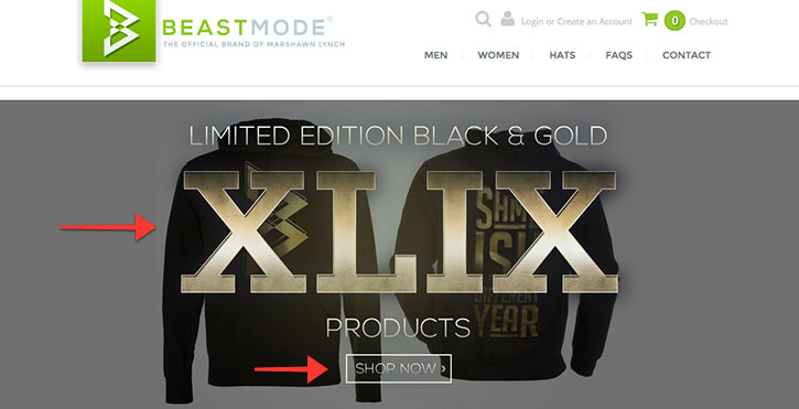
Why it Works:
By clearly stating that their hoodies in black and gold are limited edition, it immediately adds the notion of urgency and scarcity to the product.
Chances are, if you were looking to buy some Beastmode Apparel after the Superbowl and saw that, you’d be more inclined to complete a purchase.
Secondly, they utilize the idea of encapsulating the call to action button by surrounding the “Shop Now” text with a rectangular border. It stands out from the background, and grabs a visitors attention.
Sriracha 2 Go
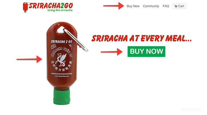
Why it Works:
Looking at their storefront, you’re probably inclined to click on one of their buy now buttons. You know exactly where to click. There’s no question of how to purchase their product.
They show what the product looks like, what it does, and how to buy it – all above the fold.
Bixbi Pet
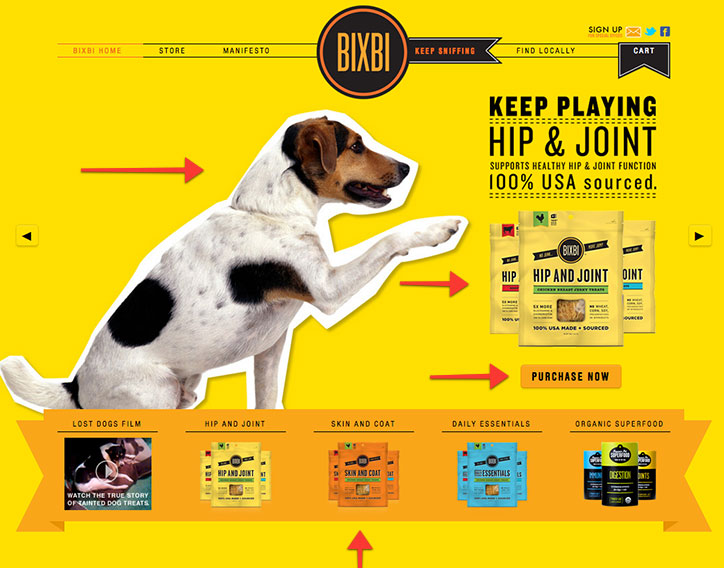
Why it Works:
They take advantage of some very bold colors on their storefront, and use a contrasting “purchase now” button to attract the attention of the visitor.
Another clever approach that Bixbi uses, is encapsulating their product collections with a banner.
Normally we see additional frontpage products lined up by name, but by making the entire collection a section of its own, a visitor is more inclined to click on them.
Department of Motivation
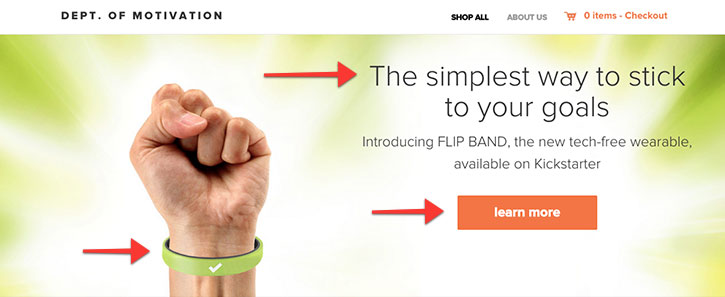
Why it Works:
Department of Motivation takes advantage of keeping the most important aspects of their store above the fold.
By taking advantage of a powerful hero image, the visitor knows what the product is, what it looks like, and exactly where to click.
By using a responsive theme, their storefront looks great above the fold on any device at any resolution.
Carry on Cocktail Kit
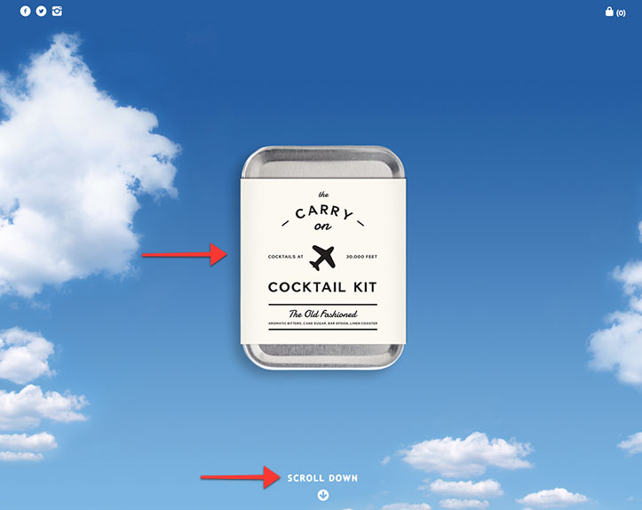
Why it Works:
Perhaps one of the most custom Shopify stores of the list, the Carry on Cocktail kit is a beautiful example of a powerful storefront that employs a simple, but effective call to action.
Upon entering their storefront, we see exactly what their product looks like. A simple “Scroll down” message is intriguing, so as a visitor we continue to scroll down to read more about the product.
It’s a fantastic example of a call to action that guides the visitor to the checkout. Plus, it is a fun spin on their branding and product.
Manpacks

Why it Works:
The Manpacks storefront is an excellent example of all of the tips we went over. Their main call to action is located above the fold, is in their hero section, and is extremely clear.
They have a clear description of what they’re selling, a very apparent call to action, as well as a secondary option to get started using Facebook.
Grovemade
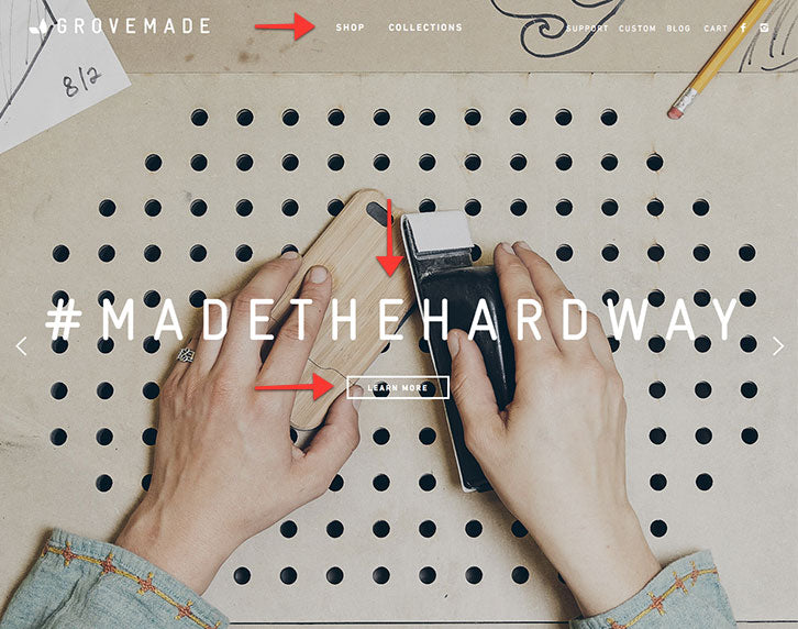
Not only does Grovemade use beautiful hero images that are full width, full bleed on their storefront, but they’ve managed to make a fun and fantastic call to action.
A visitor knows exactly where to click upon visiting their store, as their call to action is very apparent without being too distracting.
Furthermore, their navigation menu is very simple making it obvious where a visitor would need to click if they wanted to purchase a product.
Conclusion
Now that we’ve seen some call to action examples, it’s your turn to take action and apply some techniques to your store.
Try testing a few variations of colors, text, and more on your own store to see how well it works!
